What Makes a Homepage Actually Work
(Hint: It’s Not a Slideshow and a Welcome Message)
Your homepage isn’t just the front door—it’s the pitch.
And most small business homepages are trying to do way too much (or worse, not doing anything at all).
So what actually works?
Let’s break down the anatomy of a homepage that connects, builds trust, and drives action—without overwhelming visitors.
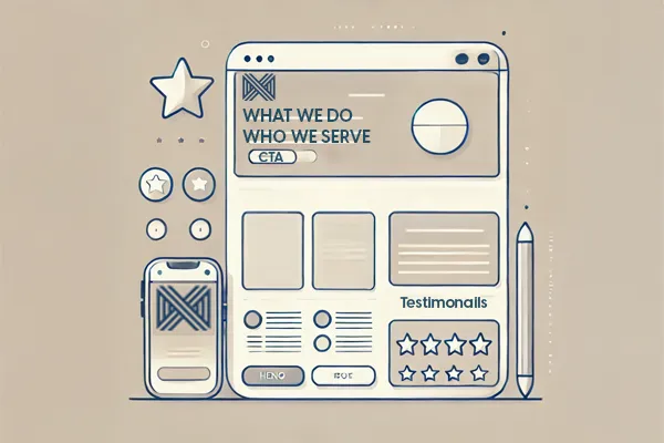
🧠 1. The Hero Section (Top of Page)
This is what people see first. You’ve got 5 seconds—maybe less.
You need:
A clear headline: what you do + who it’s for
A short subheadline: the outcome or value
A primary CTA button: “Get a quote,” “See services,” etc.
Avoid:
Vague statements like “Welcome to our website”
Sliders (they’re slow, outdated, and most people scroll right past)
🧭 2. The Navigation Menu
Fewer options = less confusion.
Keep it simple:
Home
About
Services
Contact
If you need more, use drop-downs—just don’t hit people with a 12-item buffet.
💡 3. The Proof Section
This is where trust starts to build. Use:
Testimonials
Client logos
Before/after photos
Why Choose Us” blurbs
You don’t need paragraphs—just a few clear reasons you’re the real deal.
📱 4. Mobile-First Formatting
Design it for the phone first, then the desktop.
Why? Because that’s how most people visit your site.
Make sure:
Buttons are easy to tap
Text is legible without zooming
Layouts don’t break or shift
✅ 5. One Clear Next Step
Whether it’s scheduling, calling, or browsing services—end the page with a single action.
Don’t just let them scroll to the footer and leave.
TL;DR – What Every Homepage Needs:
A clear offer up top
Simple navigation
Real social proof
Mobile-friendly layout
One clear call to action
Want to see how your homepage stacks up—or how it could look if it actually worked?
👉 Get Your Free Homepage Concept
Tomorrow: We’re finishing strong—talking about trust. How to make your website instantly feel credible (and how most small businesses accidentally kill that trust on sight).
